As we all notice, all presentations in The World’s Worst Powerpoint Presentations are messy and hard to read, not only for abled people, but also for disabled people. There is too much information in one slide and no highlights for main ideas. These presentations are lack of organizations and cleanliness. They are missing multiple principles, such as the Coherence Principle, the Signaling Principle, the Segmenting Principle, the Modality Principle, the Multimedia Principle. Furthermore, they do not focus on alignment, so they look very complicated and messy. And there is no negative space for most of them, these presentations are full of information and pictures.
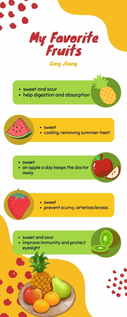
For my infographic created in Canva, I focus more on design principles, for example, alignment, repetition and balance. I use these three principles to make my visual picture more organized. The use of color which are green and yellow keeps the visual harmony. There is not too much negative space but still some space between elements. The Signaling Principle makes my infographic simple and clear. It emphasizes the main idea I want to say. Also, the Spatial Contiguity Principle and the Multimedia Principle combine the texts and visuals. Text is next to the visual. Based on the Pre-Training Principle, readers can easily understand what I am trying to say. These fruits are well-known by everyone. The whole view of picture is easy to read and understand.
Leave a Reply